WatchUSeek Watch Forums banner

Question about the loved/hated date window function that I would love a satisfying answer for...

2.9K views 38 replies 26 participants last post by  Perseus  
#1 ·
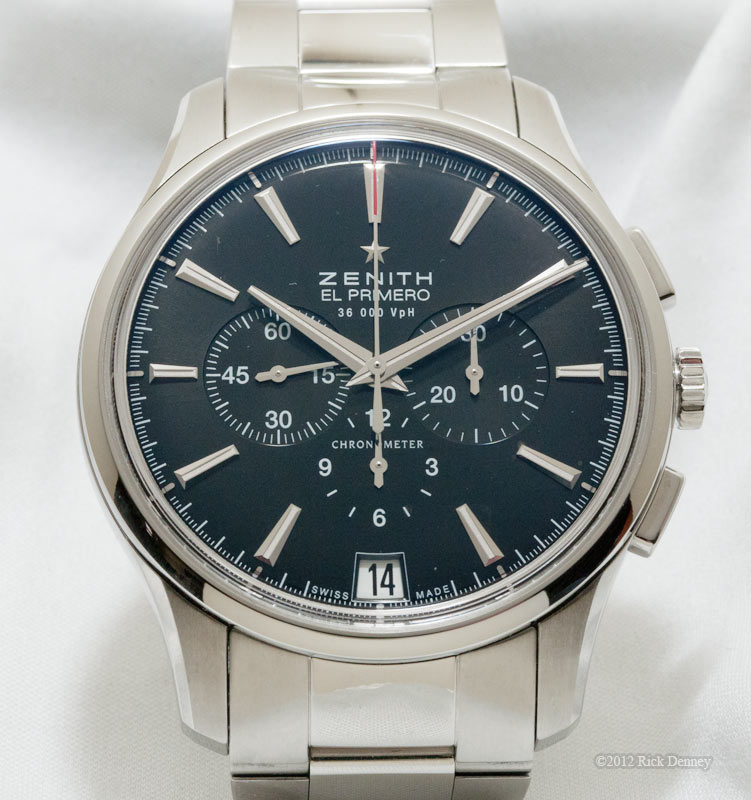
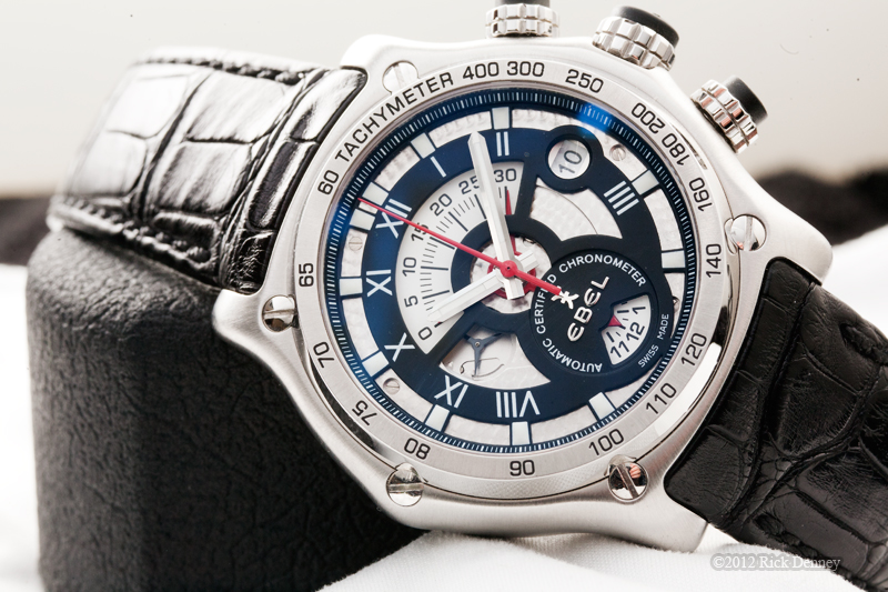
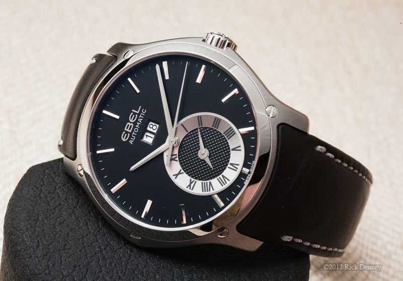
The other day I was reading a review of a Patek Philippe watch that cost over $35,000 (for the cheap model that is) and I noticed how ugly and out of place the common white/black print date window looked on the dial. This was somehow not mentioned by reviewer - but are you kidding me?!

This has always been a pet peeve of mine since I am someone who likes the date window but agree that they take away from the design of the watch.

So,,are you are telling me that on a watch that costs over $35K they cannot spring for a different date wheel that matches the dial?! For example if the dial is champagne or blue make the date wheel/disc (or whatever it is called) match the dial. It's that simple.

Do some of these brands only have a white disc that they use for every watch? This seems to be the case since these watch manufacturers even cut out the date window on the dial to match with the specs of the date wheel they already have even if it looks weird instead of designing a new one. This is crazy - especially on high end watches.

I understand this practice on cheaper watches but in general this should not be accepted if you are paying good money. I mean, even the opposite - a black wheel with white writing instead would look better on most watches!
 
#6 ·
Pricing and feature functionality are not always correlated. At some price point, you are paying for art\history\hand-finised movements, etc...

My experience with watch characteristics have been:
1) affordable watches (<$250):
- mineral glass
- possibly no hacking, no handwinding on auto mvmt
- minimal mvmt decoration (either display back or hidden)
- non-screw down crown
- low-beat mvmt
- date wheel does not match watch dial
- date window simple cut out with no border\levelling

2)mid-price and entry luxury watches ($500-$5K) - higher level features
- sapphire crystal\AR
- some perlage\decoration on mvmt\rotor; display case back
- hacking seconds
- 28,8k\36.6k bph mvmt
- screw-down crowns
- matching date wheel, and date window borders\leveling

3) high-end luxury watches ($20K+)
- hacking may be missing
- date wheel coloring may be mismatched
- low-beat movements can be found
- but ton of mvmt decoration, hand-finishing, design originality, design execution (overall), small details etc.

I think mid-range watches need to have "features" that people expect in order to justify their price premium over affordables.
But high-end brands\watches rarely need to justify their price. They are often Veblen goods, or focus on very different aspects of value-prop.

Hence Patek can deliver a Nautilus with a white date wheel on a blue window, no hacking seconds, and just 35-45 hr PR, and still have waiting lists at AD for these SS models.
 
#7 ·
For me the date wheel provides useful information. So it should fit in with the rest of the watch while also making the date readable. It could fit in by having the background match the dial color or a brushed metal background could work too. Black background would stand out and not look good on non-black dial watches.

A even more bothersome design flub is migration of the date window toward dial center. The dial looks so much cleaner if the date window is kept close to the bezel. It's a consequence of using standard size movements in bigger watch cases.
 
#9 ·
For me, knowing the date is as much a part of telling time as hour, minute, and second markers. While I own a few watches that have no date indicators, that's only because they are either skeletons or a golden bridge. Not having a date indicator is like not having a second hand: Blasphemy! [Only slightly kidding, of course.]

That said, I can understand why some want color-matched date wheels on their watches; it unifies the theme of the design. Yet while I prefer color-matched date wheels, it's not a deal-breaker. One reason why: Legibility. Black numerals on white backgrounds are easier to read and easier on the eye than white numerals on colored or black backgrounds. Another reason, as brandon/ pointed out on another thread about AR and pet peeves, is that color-matching can actually ruin the design; a watch with white minute markers like a Seiko Sumo looks better with a white date wheel than one that matches up to the black dial.

What really bothers me is when a watchmaker just cuts out a date window without properly framing the date window the same way you would do with the interior of a window in your house. For me, that's inexcusable. At that point, why bother with the date window if you can't do that simple thing?
 
#11 ·
What really bothers me is when a watchmaker just cuts out a date window without properly framing the date window the same way you would do with the interior of a window in your house. For me, that's inexcusable. At that point, why bother with the date window if you can't do that simple thing?
That while it can be done to save money can also be a design decision. If you look in some modern houses there is no window trim, which in the case of a house actually requires more labor and ultimately costs more. The interesting thing is I just looked through my watch boxes and noted the higher the price the less likely my watches are to have and elaborate date window, I honestly had never thought about it before.
 
#10 ·
Most people who buy Patek watches are not young, a white date wheel increases legibility. Patek does have colored date wheels on some watches but most of them are white. I am pretty sure it is both a design choice and possibly some continuation of the history of some watches. In the end I want my date legible or not there at all, a case in point is I find the date on my Ploprofs difficult to read, certainly at a glance, looking down now I have a JLC NSD on and the white on black date wheel is not particularly legible. Different horses and all that.
 
  • Like
Reactions: Sevenmack
#21 ·
I like having the date on my watch and I totally agree that they should match the dial. I sold a breitling navitimer limited edition because the white date wheel was bothering me. It didn't match the other white components. The regular edition has a black date wheel which I much preferred.


Sent from my VS985 4G using Tapatalk
 
#24 · (Edited)
1. Date should be readable at a glance, so it's a case of function over form.
2. Black on white provides the highest degree of contrast regardless of lighting conditions.
3. Not everyone has 20/20 vision, so matching dial/ date wheel is not appropriate for everyone.

Readability is key, hence therefore also the ever so popular "big date" watches.

Keep in mind that a lot of rich elderly have poor eyesight.
 
#31 ·
Date feature on a Watch = I do not like.
 
#37 ·
I don't mind the contrasting date wheel on this watch--it provides balance on the dial:

Image


This one likewise, and the dial-mounted magnifier is the right way to do a magnifier:

Image


This Datron reissue put the date at 12, with a round window, to reference the Movado Museum. The silver keeps it subdued.


This one has a similar font, but simpler so that it fits, and the look is right:


This one has a contrasting date wheel (rather, wheels), but the big date is a feature of the watch, and it doesn't need to be hidden. Truth to tell, black numerals on a white background is the most legible combination.

Image


My conclusion is that there are no rules. The result either works or it doesn't.

Rick "not easy offended by a legible date window" Denney
 
#38 ·
I like a date window in all my watches. Some people have internal calendars in their heads... I am not one of those people. I like being able to glance at my watch and see the date right there.

I also have no issue with a contrasting date window. For some watches, I prefer it to match, but I like the contrast for others. My EF503 has a white date dial and a black face, and I don't mind at all.